

Writing + Design = Power: Journal #1
In our assigned articles “Why designers write” & “Design + Writing = power” both authors argue that writing isn’t wholly separated from design and that it's integral to design in fact. The Go Media article stresses that writing is a form of design refinement in a way. They describe writing as a form of refining design, when designers put their design into words it can help them see the flaws and holes within their designs. Similarly the UX collective piece frames writing as a strategic tool that elevates a designer's impact more, highlighting how writing shapes user experience through clear language and persuasive storytelling which benefits product decisions and satisfies shareholders and such.
What is emphasized throughout these articles is that writing is not secondary to design. Writing is advocating for careful design, stringent reassessment and observation. Writing also serves a value in being descriptive in how it can criticize and improve a design. Thoughtful writing is key to communication between designers and clients, good use of writing in these situations can lead to increased understanding and better feedback which ultimately leads to a better product.
In sum, while I previously viewed writing as a necessary but lower-priority task, I now appreciate it as a core design competency. Designers who can write clearly are better collaborators, clearer thinkers, and more effective at influencing product outcomes.
Keywords: why designers write, design and writing, writing as a design skill, Go Media writing for designers, UX Collective writing, design communication, design refinement through writing, designer client communication, writing in user experience, persuasive storytelling in design, design competency, communications design.
Carl Dair's Seven Dimensions of Contrast in Typography: Writing Journal #2
In Carl Dair's reading on typographic design, he argues that contrast is the foundation of effective typography and breaks it down into seven specific dimensions. These are size, weight, letter structure, form, colour, texture, and direction. Dair compares them to the seven notes of a musical scale, suggesting that designers can combine them in endless ways to create compositions that feel intentional and visually engaging. What stood out to me is that he treats contrast almost like a language. Without it, typography flattens out and loses any sense of hierarchy or meaning.
Contrast of size is probably the most familiar of the seven. Dair traces it back to Gutenberg, who set his first type in a single size but had scribes paint large initials by hand. That tension between display size and body size is still how modern newspapers, posters, and ads grab attention. His point about keeping the contrasting areas roughly equal in weight was useful, because just slapping a giant letter next to small type doesn't actually work if the smaller element can't hold its own. Contrast of weight follows similar logic. Dair compares it to chiaroscuro in painting and stresses that there's no middle ground. Bold against light, or it isn't really contrast at all. He warns against using bolds that were cut as companions to classic faces, since they often look like worn down versions of the parent face instead of a real contrast.
Contrast of structure is where Dair separates type into two groups, the monotone faces like sans serifs and square serifs, and the thick-and-thin faces like roman, italic, and most scripts. Two members of the same group won't really contrast with each other, but pairing across groups creates real visual interest. Contrast of form gets a little more subtle. This is where capital meets lowercase, roman meets italic, condensed meets squat. Dair makes a good point that script against italic doesn't work because they share too much DNA, both coming from the cursive hand. It becomes conflict instead of contrast.
Contrast of colour was interesting because Dair frames it less as decoration and more as a strategic tool. He explains that warm colours advance and cold colours recede, so a small touch of red can carry as much weight as a large block of blue. He also pushes back on the assumption that one-colour jobs need to be black, suggesting deep grays, browns, or reds as ways to give a printed piece more individuality. Contrast of direction was one I hadn't thought about much before. Dair points out that humans orient themselves vertically and horizontally, so when typography breaks that grid, it creates tension. A ninety-degree intersection between two type elements becomes a focal point, almost like a magnetic field. He warns against turning critical text sideways though, since it works against reading habits.
Contrast of texture ties weight and structure together. Texture only really shows up when there are enough letters to create a pattern, and Dair describes it in tactile terms, hard versus soft, rough versus smooth, tweeds versus silks. The way letter-spacing or leading can change a textural read of the same type face was something I wanna pay more attention to in my own work.
Overall what I took from Dair is that contrast isn't just a styling choice, it's a core design competency. Without it the page goes flat and the message gets lost. The seven dimensions give designers a vocabulary to work with, and the strongest typography usually uses more than one of them at once. Going forward I want to be more deliberate about identifying which dimensions I'm leaning on in a layout
SEO Keywords used: Carl Dair, typographic design, seven principles of typographic contrast, typography principles, visual hierarchy, contrast of size, display size, body size, contrast of weight in typography, contrast of structure, type pairing, font pairing, sans serifs, square serifs, contrast of form, contrast of colour, graphic design, contrast of direction, legibility, type texture, letter-spacing, leading, communication design.

Networking at Elon's Communications and Sport Management Meet-and-Greet: Journal #3

On March 4, 2026, Elon University’s School of Communications hosted a Communications and Sport Management Meet-and-Greet on campus. The event gave students the opportunity to connect with industry professionals both in person and virtually. Students were able to ask questions about career paths, learn more about different companies and industries, and explore potential internship and employment opportunities.
During the event, I spoke with Kenny, a recruiter for SMT, a sports-media technology company. Bores encouraged students to keep an open perspective when thinking about their future careers. He explained the benefits of SMT and his path to working there. His main advice was to remain open-minded and recognize that communications professionals can find opportunities in a wide variety of industries.
I also had the chance to speak with the study USA coordinator who was very helpful in finding me resources and giving me information about the program as well as guiding me towards what programs would be applicable to me.
Keywords: Elon University School of Communications, Communications and Sport Management Meet-and-Greet, SMT sports media technology, networking event, college networking, career paths in communications, sports media careers, internship opportunities, Study USA program, industry professionals, recruiter advice, Elon University events, communications industry, sport management careers.
How I Built a Pop-Up Book About Surviving WWII in Kastri, Greece: Journal #4
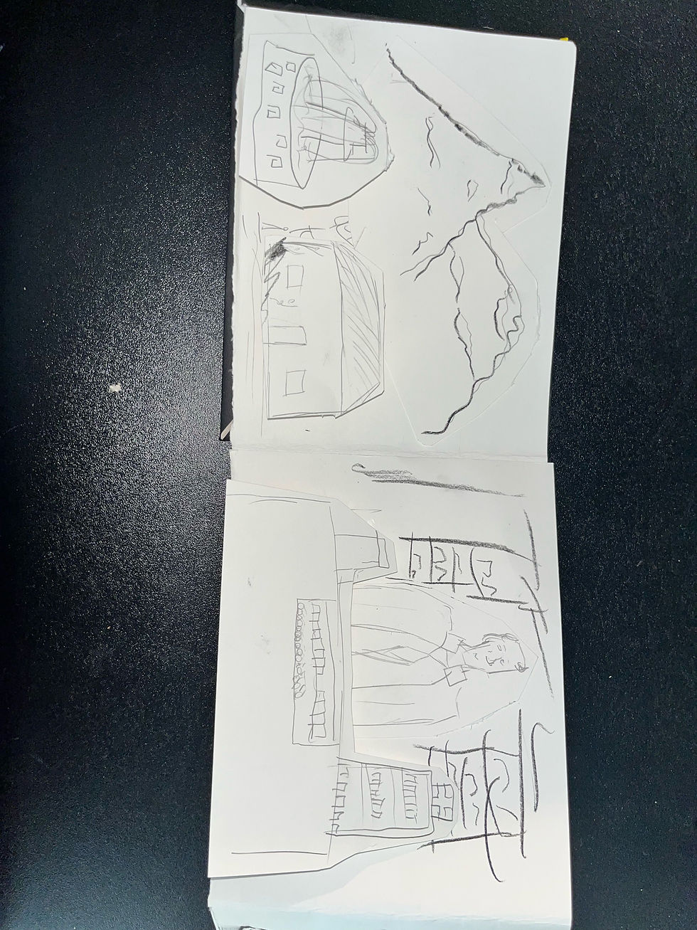
This assignment was based on making a flipbook about some ancestral story. The book was formatted on a 9in by 7in paper and consisted of a homemade hardback front and back covers. The materials mostly consisted of sketch paper, tape, glue and paint. This project was intended to make us expand our thinking when tackling artistic projects and I decided to do this by creating pop-up book elements throughout the book. These were done with just paper and tape and needed to be structurally sound and artistically detailed as they literally popped out in the reader's face.
The concept was to tell the story of my great grandfather also named Constantine, who lived in Greece during the second world war. He worked at a pharmacy in the village of Kastri. Doing research by talking to family I figured out key aspects of the story. He was taken by german soldiers during the italian-greek sector of the war, they intended on executing him as they were doing with many able bodied male citizens, but through charisma and luck he managed to convince them to let him go, though they warned him to never return to Kastri. He eventually did and soon after took his family to America. Using this I wanted to provide a short snippet into that story and detail the struggles he endured so that I could eventually exist.
Some limitations I had beginning this project was the flimsyness and difficulty when working with almost exclusively paper. Using tape and such didn’t stabilize the paper much and it was more down to managing weight of each popout along with folding stands correctly. I used paper springs to create the pop-out and while I figured they wouldn’t have much use I just needed enough to present.
The end result was pretty satisfactory to me. I felt it was structured and durable, the story was detailed and moving, the art was nice and aesthetically pleasing.
Despite these challenges, I was still able to complete the project in a way that communicated the story clearly and visually. Working through the structural problems with the paper forced me to think more carefully about how each pop-out was constructed and how the weight and folds would affect the movement of the pages. Even though the materials were simple and sometimes difficult to stabilize, the pop-up elements helped bring the story to life and made the book more interactive for the viewer. In the end, the project not only allowed me to experiment with a different artistic format, but it also gave me a way to visually represent an important part of my family’s history and the experiences my great grandfather went through before eventually coming to America.
Keywords: pop-up book design, handmade flipbook, ancestral storytelling, paper engineering, Greek family history, World War II narrative, Constantine story, handmade hardcover book, pop-up book elements, paper craft, visual storytelling, family heritage project, interactive book design, Kastri Greece, immigration story



Good Design in Your Pocket: Journal #5
Some of the best designs are the ones you never think twice about. The red Circle K Bic lighter I own is one of those objects. It chills in your pocket, rolls around in your car's cupholder, and gets passed around without a second thought. But when you actually stop and look at it, there's something going on.
The first thing that attacks you is the color. That bright red shell with the white Circle K logo printed on it turns a generic gas station purchase into something with identity. Bic didn't need to do much. That shape has hardly changed within decades due to the fact that it already works. It fits naturally in your hand, the flint wheel has just enough resistance, and the flame lights consistently. That's years of refining a design until it feels invisible.
The thing that is interesting to me most is how this lighter lives in two worlds. It is a practical device but carries branding like a billboard, when you pass one your lighter you give them an opportunity to view Circle K’s Logo. There's something interesting about a product that serves its purpose so well that companies fight to put their name on it.
On a sensory level, the lighter covers a lot of ground. The plastic shell is smooth but not slippery. The flint wheel has a textured grip that you can feel catch before the spark hits. Then there's the click of the gas releasing, the hiss of the flame, and the faint smell of butane. All of that happens in less than a second, but every sense is involved. Is it advanced or anything, no but it has the simple things a lighter must have.
I keep coming back to one question. Why does something so disposable feel so well designed? And at what point does a throwaway object earn the right to be called good design?
Keywords: Bic lighter design, Circle K branding, everyday objects, product design, disposable design, sensory design, gas station products

Scientism in Design: Journal #6
In his 2011 piece "The 'Science' of Good Design: A Dangerous Idea," Ben McAllister argues that designers are buying into something he calls scientism, which is basically the look of science without any of the actual rigor behind it. He opens with a story about an ad exec who shut down a real conversation by saying "I've seen the research," and the rest of the piece builds off that moment. He pulls in F.A. Hayek and Paula Scher to back up the idea that when designers reduce their work to a mechanical process, the human side of it gets flattened out.
McAllister has a point. The strongest part of his argument for me is how "the research" gets used to end conversations instead of start them. I have seen versions of this. In my Comm Design lit review on Natural American Spirit branding, I worked with research from cultural studies, public health, and regulatory documents, and the same data could get spun two completely different directions depending on who was holding it. So when McAllister says data gets "bent to the will of the analyst," that lined up with what I was actually seeing in my sources. Scher's whole "faux info" critique of infographics rang true too. A lot of branding now uses graphics that look authoritative without earning it.
Where he overreaches is in how clean the binary gets. McAllister frames it like mechanical research is on one side and creative judgment is on the other, but most design work I have done doesn't really live at either pole. When I was writing the creative brief for the Little School, research into their Reggio-inspired teaching philosophy was the thing that made the writing land. Cut that out and the brief becomes guesswork. Same goes for Carl Dair's seven principles of typographic contrast. Those didn't come from a designer just feeling his way through it. Dair built them out of careful observation, and they still leave plenty of room for judgment when you go to actually apply them. So research and creativity aren't really enemies, in a way they prop each other up.
McAllister is right that designers shouldn't use data to dodge tough creative calls. But leaning too far into "design is mysterious" can also make the field sound flaky to a client who's writing a check. The honest version sits somewhere in between.
Keywords: Ben McAllister, scientism in design, science of good design, design critique, Paula Scher faux info, F.A. Hayek scientism, data-driven design, communications design, Carl Dair typographic principles, creativity and research, branding.


